Plus icon

Unifying the Queensland Government digital customer experience

Role: Lead UX Designer • Queensland Government • 2024-2026
UX strategy
Digital transformation
Connected digital experience
Mobile first design
WCAG 2.2 Level AA
Images of Queensland Government website on mobile devices

Background

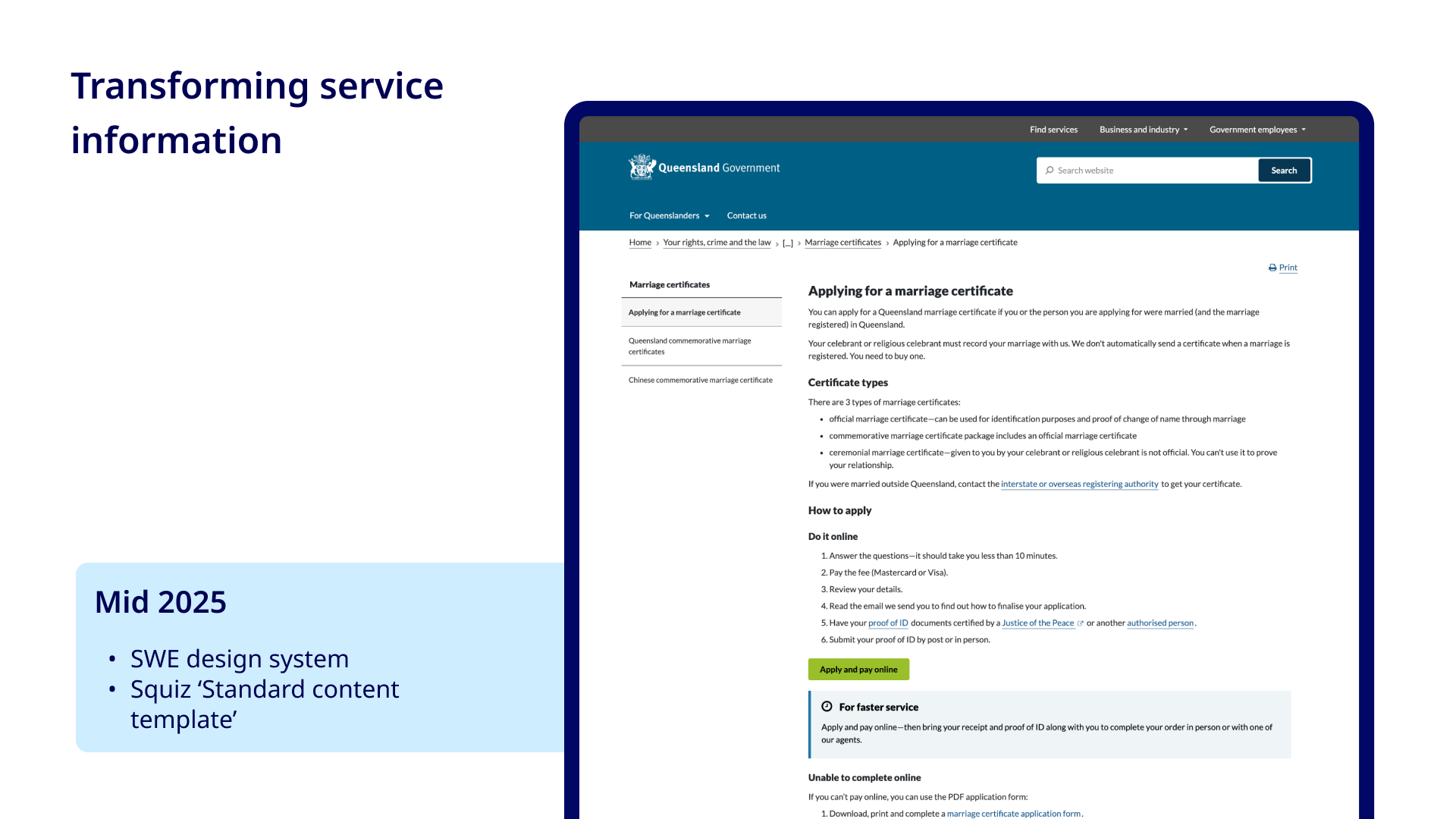
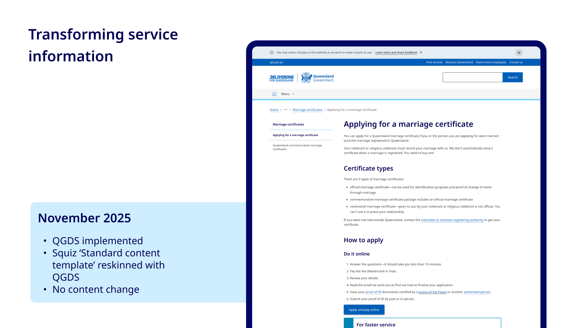
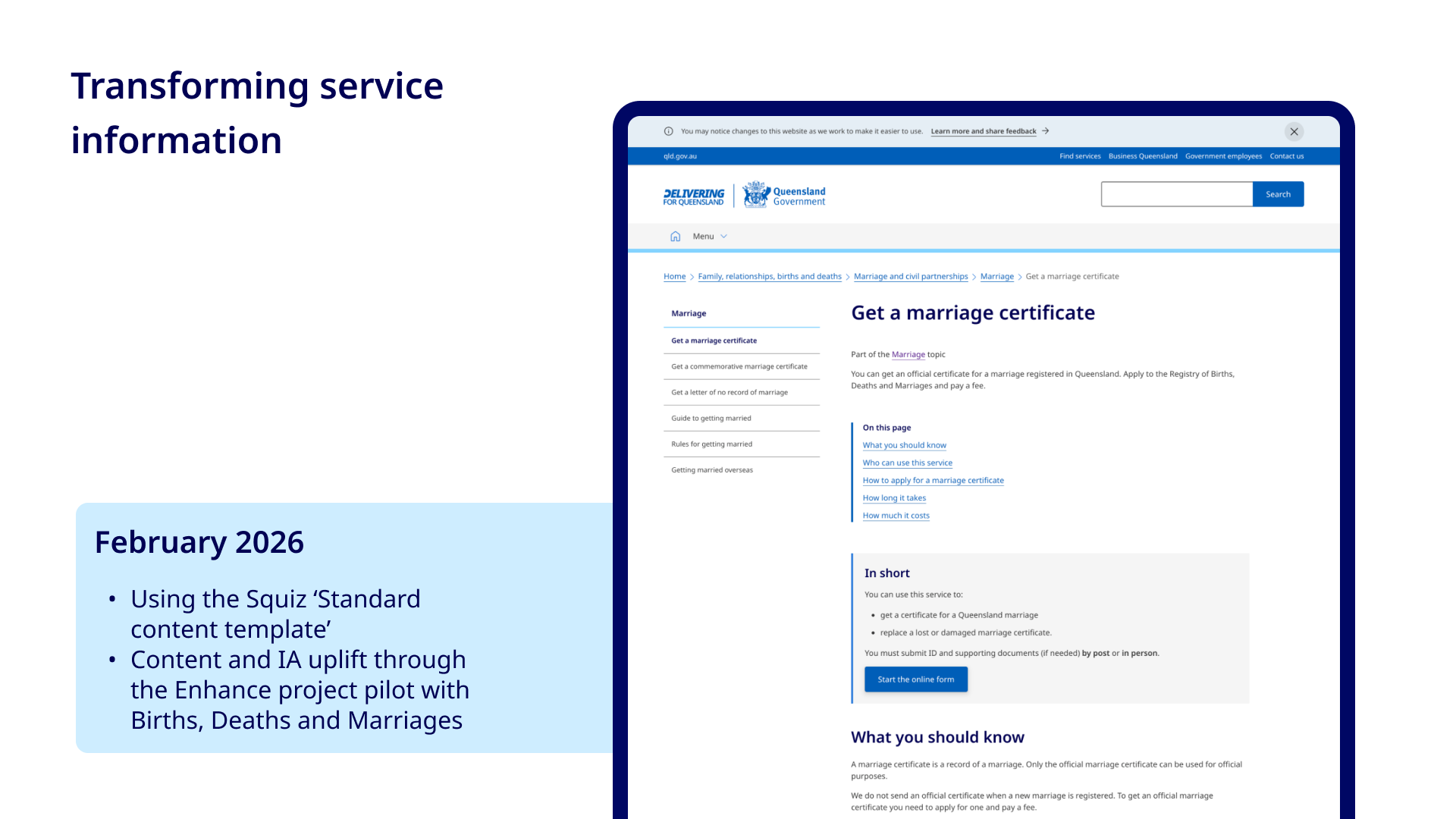
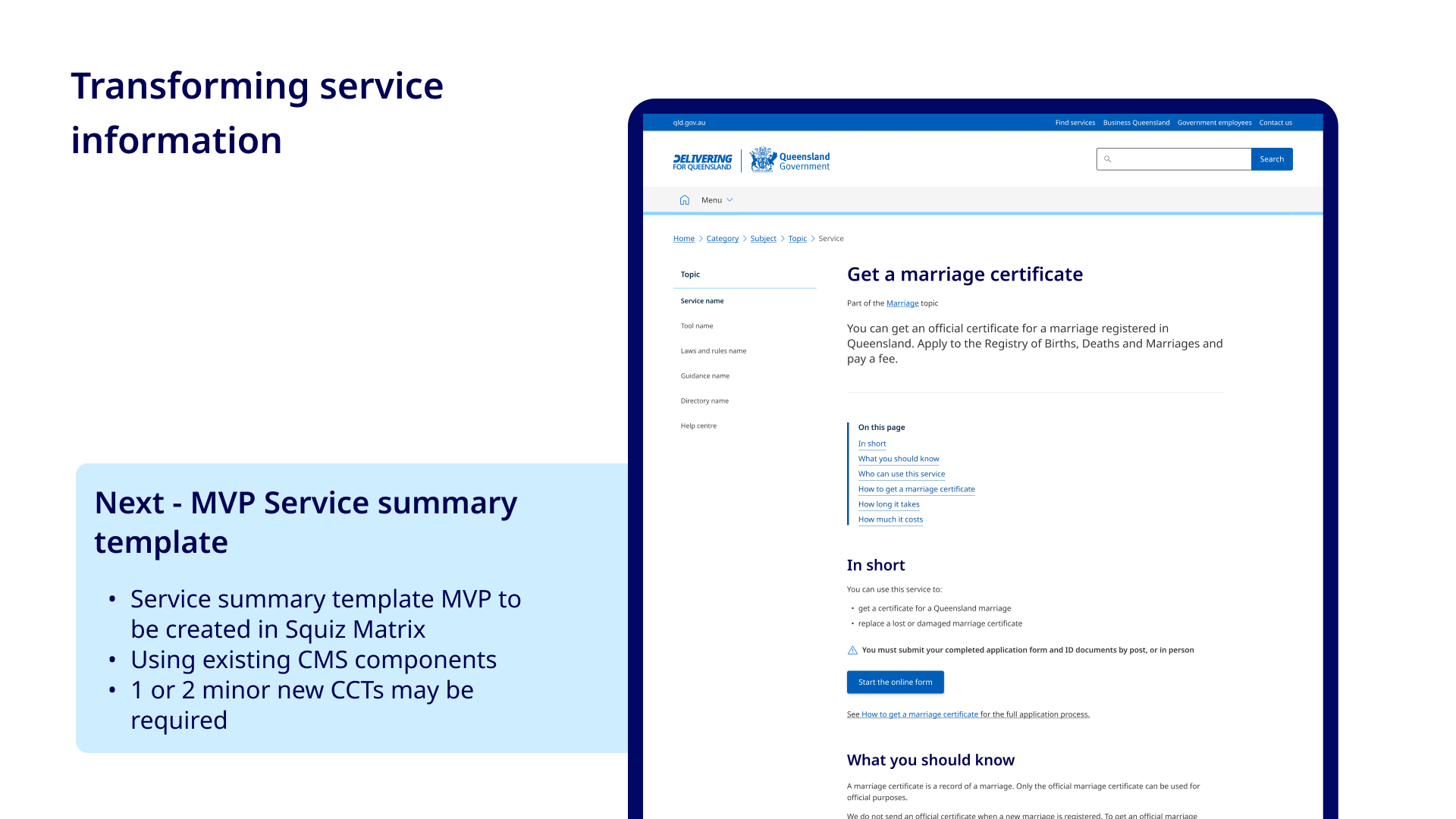
In 2024, I stepped into the role of UX Design Lead in the department now known as the Department of Customer Services, Open Data and Small and Family Business.

I started out in a small but growing team, with a critical task - define the UX strategy and target state vision for the Queensland Government’s digital customer experience across its primary channels.

This ecosystem included:

  • The public service and government information website (qld.gov.au).
  • The authenticated whole of government customer service platform: Service portal, Service builder and their supporting service, such as email notifications.
  • Enabling services such the Digital Identity Broker
  • Service content, forms and portals located elsewhere out in departmental sites

Collectively, these products formed the digital front door to government services.

Individually, they functioned well enough. Together, they did not.

The reality at the time

From a customer’s perspective, the digital experience felt fragmented.

A person might:
  • Discover a service via a search engine
  • Land on a deep link within qld.gov.au
  • Click into an online form hosted elsewhere in other sub-domains without any warning they are leaving the site they are on
  • Authenticate through a separate identity experience, or not securely authenticate at all if the legacy platform didn't support it
  • Receive email notifications in a variety of different visual styles and written tones from different platforms or directly from agencies
  • Track their submission in many different platforms without any interconnection or they may be required to use an offline channel to chase updates
Images of legacy web content on qld.gov.auImages of legacy content on qld.gov.au and early implementation of the customer services platform
Each step looked and behaved differently per service.

Behind the scenes, this fragmentation reflected organisational structure. Each product had its own team: product managers, designers, content writers, and developers; operating largely independently. Collaboration across platforms was limited. Teams were focused on different projects and BAU work. Often working on similar problems in different ways, chasing a similar outcome but without visibility of one another’s work.

The ecosystem was further complicated by:
  • Multiple legacy design systems across platforms
  • Inconsistent UI patterns and branding
  • Accessibility gaps against WCAG 2.2
  • Interfaces built primarily for desktop users that did not render well on mobile devices, creating usability and access issues for the majority of customers who access online services though a mobile device
  • Inconsistent and duplicate content across many sub-domains, written at a high reading level, with inconsistent language, tone and structure
  • Online forms distributed across various legacy platforms and separate department websites
  • No clear definition of a single source of truth for service information or a single clear pathway to access government services

Strategy and approach

To address these challenges, I focused on three streams: alignment, standardisation, and target-state definition.

Aligning teams around the customer journey

The deeper issue was structural, not visual. Each product team was optimising for its own roadmap. No one owned the full customer journey. I began connecting these teams through shared conversations about journey continuity; mapping how customers moved from information to transaction to post-submission management.
  • Connected with siloed product teams to foster collaboration and shared ownership
  • Mapped end-to-end journeys across channels
  • Clarified where information should live and called out duplication
  • Developed user personas based on research across the platforms, which helped communicate the rationale for design and content changes to different stakeholders, ensuring decisions were grounded in real customer needs
  • Receive email notifications in a different visual style and written tone from different agencies and platforms
User personas

Standardising design and content

One of the most visible symptoms of fragmentation was the inconsistent look and feel across channels. The public website operated on a different legacy design system to Service Builder, Service Portal, the identity broker, and email templates. The experience changed dramatically as soon as a customer crossed a system boundary.

Aligning to the same design system was not simply a visual refresh. It created:
  • A consistent interaction model
  • Shared components and patterns
  • Clearer brand cohesion
  • A stronger foundation for accessibility uplift
  • Reduced duplication across teams
In parallel, I partnered with the content design team on a broader uplift of web content centred on user needs. Many pages had duplicate content or content that belonged elsewhere in other zones. The content was written at a high reading level, used inconsistent structures, and relied on government terminology. This affected comprehension and service discoverability.

I contributed to:
  • Designing new web content patterns and templates to go into the content design system
  • Improving structural consistency
  • Strengthening wayfinding
This work helped align information architecture with service pathways, improving clarity and ease while customers are seeking information before completing their job-to-be-done.
Customer journey map
Transforming the service information content pattern and template
Benchmarking
Transforming the service information content pattern and template
Sketching activity
Transforming the service information content pattern and template
Online claim application flow chart
Transforming the service information content pattern and template
Online claim application flow chart
Transforming the service information content pattern and template

Defining target-state experience while iteratively improving

Within the customer service portal, my work balanced iteration and strategy.

We improved existing features, such as:
  • Simplified entry into online forms by creating a single source of truth on qld.gov.au and adapting the existing form cover page to align with this journey
  • Personalisation
  • Submission tracking
  • Notification clarity
We also introduced service discovery capabilities, helping customers identify relevant services from within their account.

Beyond immediate improvements, I defined a longer-term vision for:
  • Persistent managed services in the portal
  • Stronger lifecycle management of submissions
  • Enhancing notifications, personalisation and support
  • Additionally, I designed a unified service app concept, informing future mobile strategy. Ultimately a decision was made not to go ahead with that concept at this time.

Current state and the ongoing transformation

The transformation is in its early stages and will take time and ongoing commitment for the benefits to be realised:
  • On qld.gov.au the content uplift is underway, moving through categories of content. The templates need full rollout
  • Majority of the service forms remain on legacy systems and will be onboarded into Service Builder in phases. This requires significant agency cooperation.
  • Further iteration is needed before the Service portal can support onboarding persistent, high-volume services
This transformation is therefore not a completed project, but a strategic repositioning of the ecosystem. Shifting from fragmented platforms toward a connected, customer-centred digital experience. The groundwork is in place; implementation continues.

Reflection

Leading UX across multiple government platforms was just as much about people and collaboration as it was about design. The biggest challenges were not the visual inconsistencies, but the silos, competing priorities, and the need to create shared ownership across teams.

I learned that defining a target state is only one part of the work. The real impact comes from connecting people, building trust, and helping teams understand the end-to-end journey as a shared mission.

This experience strengthened my approach to systems thinking, working across teams without formal authority, and designing for long-term service maturity rather than chasing quick wins.